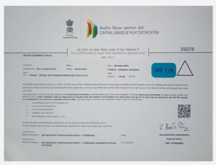
Whoever designed the colour scheme on the censor certificate, of the portion in which the category (‘U’, ‘UA’ or ‘A’) is indicated, must never have bothered to read the certificate. For, had he done so, he would’ve realised that his colour scheme is so terrible that one has to strain one’s eyes and yet, in the limited time for which the censor certificate remains on the screen, it often becomes impossible to understand the category in which the film has been certified.
The box, in which the category is mentioned, is blue in colour while the certification category is mentioned in thin fonts in black. Try reading the category next time you go for a film, and you will understand how frustrating it can get, especially if the projection is less clear.
Knowing the state of the projection in many cinemas, the colour scheme of the box needs to be changed forthwith.
And no, please don’t go by the display picture of this news item. This is far far more clear than what one often sees on the screen. Of course, sometimes, the category is legible because the projection is clear, but when just changing the colour scheme can make it simple, why not just do it?


